html+css实现环绕倒影加载特效
发布时间:2022-08-25 21:35:28 所属栏目:网页游戏 来源:
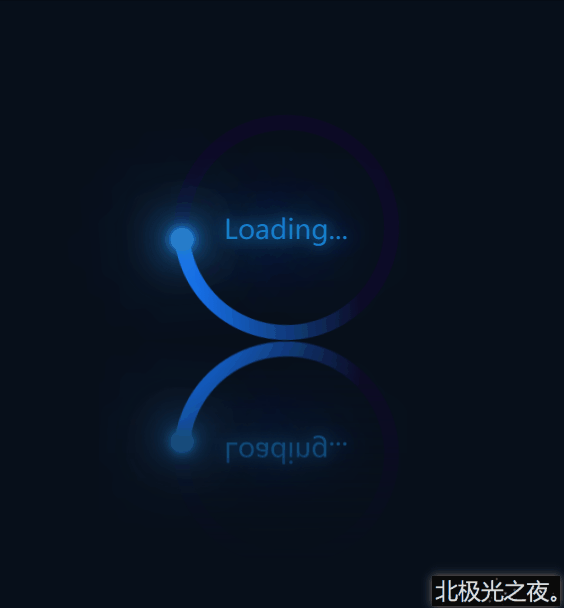
导读: 本文主要介绍了html+css实现环绕倒影加载特效,具体如下:先看效果(完整代码在底部):实现(可一步一步边看效果边编写):※先初始化(直接复制): *{ margin: 0; padding: 0;
|
本文主要介绍了html+css实现环绕倒影加载特效,具体如下: 先看效果(完整代码在底部):
实现(可一步一步边看效果边编写):※先初始化(直接复制): *{ margin: 0; padding: 0; box-sizing: border-box; } body{ height: 100vh; display: flex; justify-content: center; align-items: center; background-color: rgb(7, 15, 26); }flex布局,让子元素居中对齐。 1.定义标签:<div class="container"> <span>Loading...</span> <div class="circle"> <div class="ring"></div> </div> </div> .container是最底层盒子。 2. .container的css样式:.container{ position: relative; height: 150px; width: 250px; -webkit-box-reflect:below 1px linear-gradient(transparent ,rgb(7, 15, 26)); }-webkit-box-reflect:该属性能实现倒影特效。详细。 3. .circle的css样式,动画部分可暂时注释掉:.circle{ position: relative; margin: 0 auto; height: 150px; width: 150px; background-color: rgb(13, 10, 37); border-radius: 50%; animation: zhuan 2s linear infinite; } @keyframes zhuan{ 0%{ transform: rotate(0deg); } 100%{ transform: rotate(360deg); } }margin: 0 auto;居中。 4. 定义一个双伪类,为一个与背景色相同的小圆,覆盖在.circle上:.circle::after{ content: ''; position: absolute; top: 10px; left: 10px; right: 10px; bottom: 10px; background-color: rgb(7, 15, 26); border-radius: 50%; }5.定义蓝色环形效果,因为被第4步的小圆覆盖了,所以直接定义一个渐变的蓝色圆形即可得到蓝色环形:.ring{ position: absolute; top: 0; left: 0; width: 75px; height: 150px; background-image: linear-gradient(180deg,rgb(22, 121, 252) ,transparent 80%); border-radius: 75px 0 0 75px; }background-image: linear-gradient(180deg,rgb(22, 121, 252) ,transparent 80%); 渐变颜色,先蓝色,过渡到透明色。 6.定义环形上发光的小圆球:.ring::after{ content: ''; position: absolute; right: -5px; top: -2.5px; width: 15px; height: 15px; background-color: rgb(40, 124, 202); box-shadow: 0 0 5px rgb(40, 151, 202), 0 0 10px rgb(40, 124, 202), 0 0 20px rgb(40, 124, 202), 0 0 30px rgb(40, 124, 202), 0 0 40px rgb(40, 124, 202), 0 0 50px rgb(40, 124, 202), 0 0 60px rgb(40, 124, 202), 0 0 60px rgb(40, 124, 202); border-radius: 50%; z-index: 1; } box-shadow: 阴影。 7. 定义文本loading:.container>span{ position: absolute; left: 50%; top: 50%; transform: translate(-50%,-50%); color: rgb(20, 129, 202); text-shadow: 0 0 10px rgb(20, 129, 202), 0 0 30px rgb(20, 129, 202), 0 0 60px rgb(20, 129, 202), 0 0 100px rgb(20, 129, 202); font-size: 18px; z-index: 1; } left: 50%; 完整代码:<!DOCTYPE html><html lang="zh-CN"><head> <meta charset="UTF-8"> <meta http-equiv="X-UA-Compatible" content="IE=edge"> <meta name="viewport" content="width=device-width, initial-scale=1.0"> <title>Document</title> <style> *{ margin: 0; padding: 0; box-sizing: border-box; } body{ height: 100vh; display: flex; justify-content: center; align-items: center; background-color: rgb(7, 15, 26); } .container{ position: relative; height: 150px; width: 250px; -webkit-box-reflect:below 1px linear-gradient(transparent ,rgb(7, 15, 26)); } .container>span{ position: absolute; left: 50%; top: 50%; transform: translate(-50%,-50%); color: rgb(20, 129, 202); text-shadow: 0 0 10px rgb(20, 129, 202), 0 0 30px rgb(20, 129, 202), 0 0 60px rgb(20, 129, 202), 0 0 100px rgb(20, 129, 202); font-size: 18px; z-index: 1; } .circle{ position: relative; margin: 0 auto; height: 150px; width: 150px; background-color: rgb(13, 10, 37); border-radius: 50%; animation: zhuan 2s linear infinite; } @keyframes zhuan{ 0%{ transform: rotate(0deg); } 100%{ transform: rotate(360deg); } } .circle::after{ content: ''; position: absolute; top: 10px; left: 10px; right: 10px; bottom: 10px; background-color: rgb(7, 15, 26); border-radius: 50%; } .ring{ position: absolute; top: 0; left: 0; width: 75px; height: 150px; background-image: linear-gradient(180deg,rgb(22, 121, 252) ,transparent 80%); border-radius: 75px 0 0 75px; } .ring::after{ content: ''; position: absolute; right: -5px; top: -2.5px; width: 15px; height: 15px; background-color: rgb(40, 124, 202); box-shadow: 0 0 5px rgb(40, 151, 202), 0 0 10px rgb(40, 124, 202), 0 0 20px rgb(40, 124, 202), 0 0 30px rgb(40, 124, 202), 0 0 40px rgb(40, 124, 202), 0 0 50px rgb(40, 124, 202), 0 0 60px rgb(40, 124, 202), 0 0 60px rgb(40, 124, 202); border-radius: 50%; z-index: 1; } </style></head><body> <div class="container"> <span>Loading...</span> <div class="circle"> <div class="ring"></div> </div> </div></body></html>总结:到此这篇关于html+css实现环绕倒影加载特效的文章就介绍到这了,更多相关html+css环绕倒影加载内容请搜索脚本之家以前的文章或继续浏览下面的相关文章,希望大家以后多多支持脚本之家! (编辑:泰州站长网) 【声明】本站内容均来自网络,其相关言论仅代表作者个人观点,不代表本站立场。若无意侵犯到您的权利,请及时与联系站长删除相关内容! |
推荐文章
站长推荐